
The colour you choose for your business may not seem like a big deal on the face of it. Everyone perceives colour differently after all, so you might as well just pick one you like.
Well, yes and no. Perceptions of colour are to some extent subjective and it’s true that cultural differences can influence how a colour is perceived. Nevertheless, there are some general rules on how humans tend to respond to each colour.
Perhaps you’re thinking of re-branding or completely revamping the office? Then you might want to take a look at our advice on colours before you open the paint.
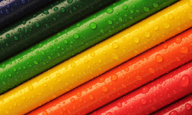
Yellow

Colour theory, which is something psychologists have been fascinated with for a long time, suggests that yellow is often associated with positive things like joy and serenity. Big surprise, right? Well the strangest thing about yellow is that whilst it is very much attributed to our more positive emotions, it also tends to be the least favourite colour of the entire spectrum. More interesting still is that those few people who do love it, tend to show a stronger active love for it then other people do with their favourite colours.
Our advice? Steer clear, yellow appears to be the great divider.
Green

Green is an interesting one and is often associated with creativity, nature and trust. As a general rule, most people are not offended by green so if you’re a creative company in particular then giving your office space a splash of green is perfect.
There’s also a huge association with safety (hence traffic lights being green for go) which is why you’ll notice a vast amount of medical establishments (including the first aid symbol) tend to utilise green. With that in mind if you are the type of business that wants to instil that sense of safety and trust then green might also be a great one for you.
Blue

Blue is the most popular colour of them all around the world. There’s an association with calmness, loyalty, cleanliness, expertise and stability. It’s especially liked by the vast majority of corporate companies (LinkedIn, Twitter, Facebook anyone?) and tends to invoke all the right kind of emotions. The trouble is it’s quite a safe colour hence being widely used but regardless, if you’re re-branding and want to appear professional and savvy, blue would be a great way to go.
Red

Frequently associated with danger, red leads to quick reactions and invokes a strong reaction in most people. There’s also a link between red and scandal or anger. That said, red is also a popular ‘colour-pop’ choice, often combined with a more neutral tone like grey and white to balance out its intensity. Many businesses adopt red as it suggests they are passionate about what they do and it’s clearly a very striking colour (Coke, Netflix, Santander, Vodaphone).
It’s also the best colour and no, not because it’s one of the ones we use.
Orange
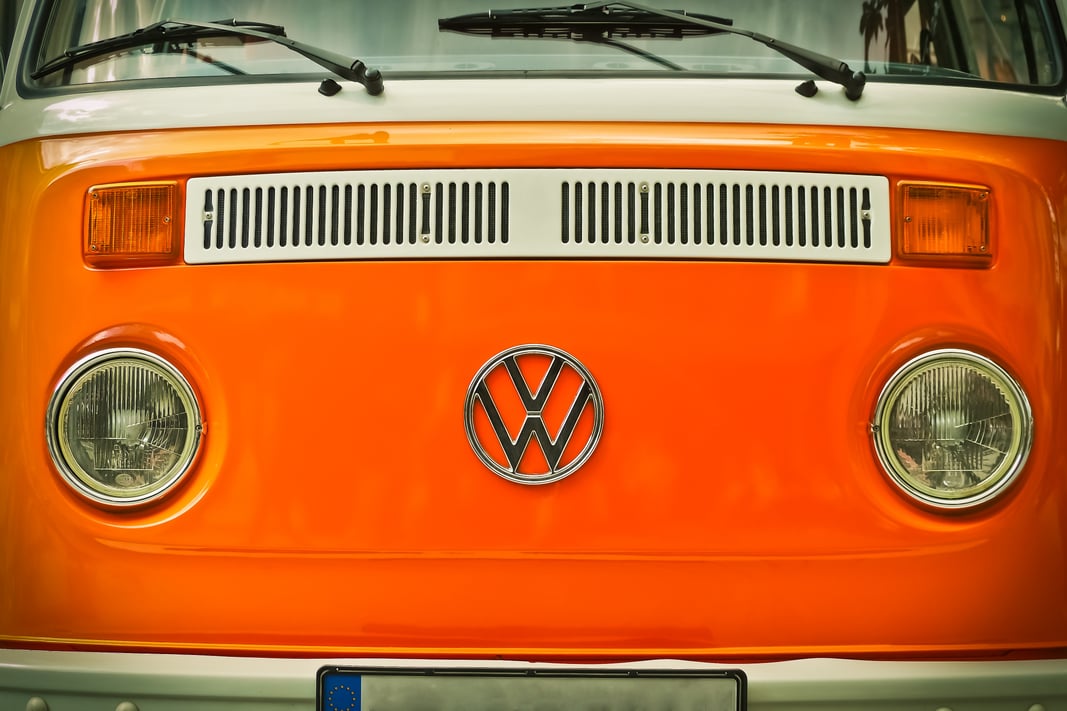
Understandably, orange is unconsciously linked to warmth, but also value, friendliness and perhaps because of the association with the onset of autumn, it’s also linked to feeling of progress and change. Orange is a good one because it’s not quite as dominant as red, nor as hit and miss as yellow.
Purple
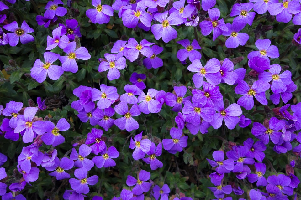
There’s a strong link between purple and royalty. Because of this there’s an inherent link with luxury (Cadburys) and wealth (Asprey). Purple can be an excellent choice for anything like jewellery, makeup or clothing companies, any business where you’re trying to put the message across that your products are high end.
Pink
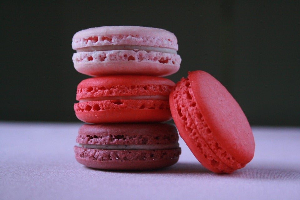
Unsurprisingly pink is strongly associated with females, which is why many women-focused companies adopt it (Cosmopolitan, Bourjois). However, there’s also a strong link between pink and fun (T-Mobile). Pink is an eye-catching colour that can be hard to pull off, but used correctly can make your company stand out.
White, Black and Grey
We know, technically they aren’t colours, but stick with us ok? White and Black are of course especially popular colour choices because they’re so clean, they nicely balance out a stronger colour like red, green or pink and alone they give a sense of luxury, sophistication and style. Grey is a little less used alone as it has strong associations with boredom or dullness, but it can be a really nice shade to tone down other bolder colours.