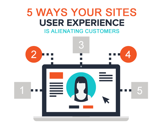
Imagine you’ve just walked into a coffee shop that you’ve never previously visited. Once inside, you find that there’s a lengthy queue, the cashier will only accept a cheque, the sugar and napkins are kept right at the back of the room, huge armchairs mean that there are barely any seats, and you’re expected to accept a 10% charge for having your cup of coffee to go.
You almost certainly wouldn’t go there again, but you might be replicating those mistakes within your own digital marketplace. Our hypothetical coffee shop provided a poor customer experience, here’s how to avoid making comparable mistakes and ensure a positive user experience for your website’s visitors.

1. Waiting Times
Don’t let poor load times affect your bottom line. One survey demonstrated that close to half of web users will abandon a site if it fails to load within 3 seconds. 79% will never come back if it continues to function slowly, and just a 1 second page response delay can create a 7% reduction in conversions.
Since 1 second can be worth 7% of sales, it clearly pays to be quick. Use an online tool to measure your site’s speed. If it doesn’t measure up, make sure you contact a professional to ensure that the site is optimised.
2. Poor Navigation
Your website could run like greased lightning, but that’s only going to be advantageous if users know exactly where they’re supposed to be going. One survey showed that a whopping 25% of consumers will drop out of the checkout process due to complicated website navigation.
Remember, navigation should feel straightforward and intuitive. Try keeping to the ‘family tree’ method; the homepage comes at the top, then come the other most important pages, with less important pages linked from the latter.
3. Demanding Too Much Information
Most people drop out of the checkout process at the very first step, and it has nothing to do with the price of the product or the expected delivery time. Instead, it’s because a website is putting too many steps in the way.
It should go without saying that you need to make it easy for people to buy from you, so remove the need to create an account before purchasing, use as few necessary information fields as possible, and remember to include a PayPal option.
4. Too Much Style, Not Enough Substance
Think your site needs to be showy to be popular? Try taking a look at this one. Your site should look good, but it should never overpower users with too much information or flash.
Utilise plenty of white space and use a large font size. Users should be able to click onto the website, see exactly what they need, and remain free from any distractions. Spinning icons and long, dense paragraphs are unlikely to foster such an environment.
5. Hiding Payments
Remember the survey that showed 25% of users leaving due to complicated navigation? Well, 56% would leave when hit with an unexpected cost, even a relatively minor one.
It’s not unusual to experience a credit card surcharge or a few pounds added for weekend deliveries, but those costs need to be presented as soon as possible. If not, people will feel as if you were trying to deceive them.
You might have thought the coffee shop example extreme, but numerous surveys have demonstrated that consumers are faced with very similar annoyances when they shop online. If you want to increase your online sales and encourage repeat purchases, start by enhancing the user experience.
Categories
- 24 Hour Call Answering Service (5)
- After Hours Call Answering (5)
- After-Hours Call Answering Service (6)
- Answer-4u (11)
- Artificial Intelligence (1)
- Business (67)
- Business Grants (3)
- Business Growth (4)
- Business Owner (6)
- Business Strategy (2)
- Call Diversion (1)
- Call Handling Service (12)
- Charity (2)
- Christmas (5)
- Customer Experience (4)
- Customer Satisfaction (3)
- Customer Service (18)
- Customer Services (8)
- Decision Making (2)
- Diary Management (3)
- Digital Marketing (16)
- Disaster Recovery (5)
- EntrepPhase (7)
- Entrepreneurs (7)
- Finance (2)
- Funding (3)
- HR (5)
- Inspiration (2)
- Leadership (4)
- Marketing (15)
- Marketing Strategy (2)
- Networking (2)
- Other (4)
- Outsourcing (5)
- Phone Etiquette (5)
- Productivity (6)
- Property Management (3)
- Recruitment (7)
- Self Improvement (2)
- Small Business (12)
- SME (4)
- Staff Training (2)
- Start-Up (9)
- Technology (2)
- Telephone Answering (16)
- Time Management (4)
- Virtual Assistant (3)
- Virtual Receptionist (12)
- Workforce (9)
- Working Environment (9)
- Workplace (28)


